Tremble

Tremble is a self-publishing app designed for literary horror fans seeking original content to read and listen to from a personalized feed catered to their interest. The project incorporates browse and search features, discussion boards, editors, and customization.


tremble preview

Fans of literary horror: Wouldn’t it be great to access a library of compelling tales born from diverse minds of those that appreciate horror as much as you? What if you could personalize this library based on your preferences and interest and access it anytime, from anywhere? How much easier would it be to seek your next thrill?


Horror writers: Can you imagine the benefits of sharing your work on a self-publishing platform that allows horror enthusiasts to find horror stories that align with their interests? What about the amount of feedback and engagement on the discussion board for every tale you publish?


Tremble gives users the control they need to feel comfortable exploring the uncomfortable while discovering unique content contributed by the community and for the community. No more rehashes of existing Creepypastas or fan-fiction riddled with grammar mistakes – this is an app that focuses on providing horror fans with stories they’ll love to fear.

Roles
  • UX Designer

  • UX Researcher

  • UX Writer

  • Visual Designer

  • Content Strategist

Deliverables
  • Competitive Analysis

  • User Surveys

  • User Interviews

  • User Personas

  • User Stories

  • Sitemap

  • User Flows

  • Style Guide

  • Paper Wireframes

  • Hi-Fi Mockups

  • Clickable Prototype

  • Usability Test Results

Tools
  • Sketchbook

  • Sketch

  • Figma

  • Draw.io

  • Zoom

  • Skype

  • QuickTime Player

The internet has made horror stories easy to find and share. However, there is an absence of interactive, self-publishing platforms dedicated to the needs of literary horror enthusiasts.

My first step was research and strategy, with which I discovered there was a target audience for a self-publishing app dedicated to horror stories in written and audio format. By learning the needs of the target audience through my research, I strategized on how I would approach the design of the product through information architecture. Then, I created a brand identity for the app before proceeding to mockups and building up a prototype or usability testing. I made several iterations throughout the design process and applied all feedback along the way – all of which you can see in detail further down.

On Tremble, horror writers can share their work with horror fans wanting to experience fear in written or audio format. Users can also tailor their feed to their interests and block content of disinterest from their experience without penalizing themselves or creators. They can also share, save, and discuss stories with others.

PROCESS > STRATEGY


Competitive Analysis

To ensure there was a market for a horror storytelling platform, I did some research on Medium, Wattpad, and Spotify, three competitors in the digital media industry that specialize in content searching and two horror storytelling apps. With my findings, I was able to answer the following questions:

  1. 1. How do competitors serve their users? What are the user attitudes toward these services?
  2. 2. What mediums can be used to experience horror? Which of these mediums apply to the problem I am trying to solve?
  3. 3. What services use these mediums for storytelling? What features do these services use? Can they help me solve my problem?
  4. 4. How do the users feel about these services? What are the pain points? How can these services be improved and implemented into my design?

Asking these questions helped me decide what services I would be analyzing and paved the way for a user survey that would help me uncover the needs of potential target audiences.


Below are the pros and cons I discovered while doing secondary research for my analysis:.

checkmark

Clean interface focused on text

checkmark

No ads

checkmark

Articles with an audio-reading of the text

checkmark

Community building through commenting, highlighting, and private messages

checkmark

Can be accessed from PC, tablet, or smart phone

thumbsdown

Only allows for more than a handful of free stories for non-members per month, while recommending mostly premium content to users

checkmark

Massive user base

checkmark

Fan-funding

checkmark

Supports over 50 languages

checkmark

Free offline reading

checkmark

Mentorship and development opportunities available

checkmark

Increase writer’s opportunity for exposure by hosting writing contests and awards

checkmark

Encourages in-person interaction by hosting annual Wattcon conference

thumbsdown

Young user base without disposable incomes makes the app difficult to monetize

thumbsdown

Disruptive ads negatively affect the user experience

thumbsdown

Inability to age-up the platform – users leave as they age

thumbsdown

A writer’s popularity is dependent on how engaged they are with their readers

thumbsdown

Writers must publish chapters regularly to maintain loyal reader base

thumbsdown

Has a reputation for housing low-quality writing

checkmark

Expansive reach

checkmark

Trials available and offered more than once for free users

checkmark

Ad revenue allows for agreeable free features

checkmark

Accessible with Google Home

checkmark

Extensive customization

checkmark

Sharing of songs and playlists

thumbsdown

Inability to view songs from artist without adding them to a playlist

thumbsdown

Podcasts only, no individual audio stories

thumbsdown

Can’t play specific songs without Premium

thumbsdown

Dependent on creators


My competitive analysis showed me there is room for a horror storytelling app that not only allows users to personalize and discover unique horror stories but lets them contribute stories themselves. I had the following assumptions based on what I learned:

  1. 1. There is an opportunity for a horror storytelling app that focuses on providing high-quality original content to horror enthusiast that enjoy reading and listening to stories.
  2. 2. While black is generally used to indicate mystery on horror story apps, dark text on a white background is easier on the eyes and is essential in this case.
  3. 3. The app should allow users to browse for and search for content in an intuitive manner.
  4. 4. Users should be able to save and bookmark content.
  5. 5. Engagement between users (readers, listeners, and storytellers) will help keep the community alive and growing
  6. 6. Sharing content is important because:
    1. a. Users can share their favorite stories (and the app) with other horror fans
    2. b. It’s an opportunity for authors and their stories to become known externally

However, although there seems to be a space for this app, is there an audience for it? Whose needs can I fulfill with the app, and how could I best meet those needs?


User Survey

I ran two surveys. The first was designed to uncover trends in storytelling preferences for storytellers, their audiences, and those who play both roles. The second helped me discover trends in horror story preferences from those who enjoy experiencing horror stories through a variety of mediums. I posted the surveys on Reddit’s r/SampleSize and Bloc’s various Slack channels. These are the highlights:


Storytelling Preferences Survey

I ran this survey over 12 days and received 90 responses.

HIGHLIGHTS
  • 1. 50 percent of respondents prefer fiction over non-fiction stories

    pie graph
  • 2. 50 percent of respondents play the roles of the storyteller and the audience

    pie graph
  • 3. 80 percent of respondents that play the role of the audience AND storyteller, (45 respondents) prefer to express their stories in writing

    bar graph

Frustration with using Medium:

  1. Paywall

Frustrations with using Wattpad:

  1. Young demographic
  2. Too much fanfiction
  3. Bad grammar and typos

DEMOGRAPHICS
  • 1. 52 percent of respondents were 18-25 years old when participating in this survey, with 22 percent being 26-35 years old

    pie graph
  • 2. 48 percent of respondents were female

    pie graph
Horror Story Preferences Survey

I ran the survey over 9 days and received 106 responses.

HIGHLIGHTS
  • 1. 88 percent of respondents enjoy horror stories

    pie graph
  • 2. 46 percent of respondents enjoy experiencing horror stories alone and 40 percent enjoy experiencing horror alone AND with others

    pie graph
  • 3. 54 percent of respondents prefer short horror stories, and 46 percent prefer long horror stories.

    pie graph
  • 4. 72 percent of respondents revisit their favorite horror stories

    pie graph
  • 5. 59 percent of respondents share their favorite horror stories

    pie graph

Reasons why respondents search for horror stories online:

  1. Accessibility
  2. Free content
  3. Variety
  4. Easy to find and revisit
  5. Feedback for aspiring authors
  6. Neverending supply
  7. Believability
  8. Short stories
  9. Originality

Frustrations with online horror stories:

  1. Grammatical errors and lack of quality check (but not gatekeeping)
  2. Too many offshoots of existing horror stories and memes/ Creepypastas

DEMOGRAPHICS
  • 1. 43 percent of respondents were 18-25 years old when participating in this survey, with 22 percent being 26-35 years old

    pie graph
  • 2. 52 percent of respondents were female

    pie graph

I would have liked to extend the run time for the storytelling preferences survey a bit longer to gain at least 30 more responses for a sample size of 100 respondents. I would have also liked to run another survey for audiences and storytellers to explore what their desired experience would be when interacting with a self-publishing app.


The most challenging aspect of user research was finding the right wording for the title of the survey and survey questions. For example, “Storytelling Survey” can mean a variety of things and is a bit vague, but “Storytelling Preferences” expresses that I will be asking respondents about their taste in storytelling methods.


User Interviews

I conducted five remote interviews with horror enthusiasts between the ages of 18-35 that live in the United States. I learned about the variety of experiences each interviewee had with searching for stories online. Almost all commented on how the internet made horror stories more accessible.


The Importance of Community, Intimacy, and Maintaining a Schedule

My first interview was with Josh, a former Wattpad user. From his experience, Wattpad does not uphold a standard that will improve the quality of work on the site. As a user, he spent time reading several stories that he eventually abandoned due to authors not committing to a consistent publishing schedule. Some stories were not updated for months and without warning. Did the authors desert their work and their readers? How could this be prevented?


My final interview was with Naja, who believes hearing someone tell a story is a more communal and intimate experience than reading. She also considers stories that are fleshed out and don’t cater to an audience to be more enjoyable. “Fear is vulnerable. It forces the audience to go in the darkest pits of their minds. Horror stories need to be thought out, and writers cannot afford to be lazy."


As a writer herself, Naja thinks self-publishing is a great way for authors to have their work discovered while avoiding the "B.S. of the publishing house block."


Here are more opinions gathered from my interviews:

  1. 1. It can be difficult finding free horror audiobooks
  2. 2. Difficult to find translations for foreign horror stories
  3. 3. Audio stories are atmospheric and great for when multitasking
  4. 4. Horror stories online are better than those in libraries – innovative and new
  5. 5. Horror is most powerful when combining mediums
  6. 6. Experiencing horror with others makes the experience more exciting
  7. 7. Free stories matter more than quality
  8. 8. Quality of stories may improve with incentives

User Personas

After reviewing survey results and the notes I took for each interview, I created three user personas that would help me layout my target audience’s various backgrounds, goals, needs, and motivations. Creating these characters helped me refine initial requirements and land on tasks that were essential enough to be considered for the MVP.

Persona #1 | The Aspiring Voice Actor

JOHN WALKER

WORKING SINGLE PARENT

DEMOGRAPHIC

Age

25-36

Occupation

Customer Service

Location

Atlanta, GA

Gender

Male

Tier

Storyteller

"I want to present my work on an immersive platform can expose me to my desired audience. I also want to share my joy of horror with my child at his level.”

Bio

John is a single father of one who spends most of the day working as a customer service representative at a local gym. When he's not working, he divides his time between his passions – filmmaking and voice-acting – and bonding with his 8-year-old son. More often than not, he does them simultaneously and brings his kid to gigs when allowed. John hopes to make a living off his passions someday. His hobbies include Dungeons and Dragons, watching movies with his son, writing and filmmaking.

Motivations

John misses the experience of being terrified as a child and would love to experience the same feelings as an adult. He loves the breadth of stories available to him online. However, they often fail to meet his expectations due to a lack of authenticity, distractions from typos, and unpleasant formatting of written pieces. John is also looking to publish his work for others to enjoy and would like to do so on a platform that values horror and quality over quantity.

Goals
  • Self-publish his work on a platform that values horror
  • Receive feedback from listeners
  • Gain a following of fans
  • Find kid-friendly horror stories to share with his son
Frustrations
  • Has trouble with finding an online platform dedicated to the self-publishing of original horror stories
  • Difficulty finding age-appropriate horror stories to share with his son

Persona #2 | The Young Author

ZADIE DAVIS

BUSY COLLEGE STUDENT

DEMOGRAPHICS

Age

18-25

Occupation

College Student

Location

Chicago, IL

Gender

Female

Tier

Dual User

"I want the opportunity to grow as a writer by engaging with a community of peers and audiences that have an appreciation for storytelling."

Bio

Having lived in Okinawa during her childhood, Zadie has grown an appreciation for different cultures and finds excitement in exploring the unknown. Now a college student living in the states, she enjoys studying and reading both English and Japanese literature – folklore in particular. When she's not studying, she spends a lot of time editing for her school's literary magazine in communal spaces on campus. Her hobbies include dancing, writing, and reading.

Motivations

Always looking for ways to build her craft, Zadie has been an active user of Wattpad since high school but is looking to transition to a self-publishing platform for older audiences that value quality, fictional works. Now studying Creative Writing in college, she wants to improve her craft through collaboration, critique, and discussion with others while publishing works in her favorite genre – horror. An inspiring home for her work that allows her the opportunity for improvement would be most ideal.

Goals
  • Receive feedback from readers
  • Critique and discuss the work of others
  • Explore stories based on preferences
Frustrations
  • Lazy writing from horror authors
  • Lack of quality control on self-publishing websites
  • Too many offshoots of existing horror stories online

Persona #3 | The Horror Enthusiast

SYDNEY HALL

ADVENTUROUS TEENAGER

DEMOGRAPHICS

Age

18-25

Occupation

High School Student

Location

Aurora, Colorado

Gender

Female

Tier

Audience

"I want to discover and keep track of my favorite horror stories in one place and have the ability to access them during camping trips and travel. I also want to share my favorites with others."

Bio

In her senior year of high school, Sydney would love to have a part-time job for spending money, but her parents prefer she focus on her education. Having to commute to and from school, she enjoys listening to podcasts and audiobooks to pass the time. Her hobbies include discussing various topics with others on Reddit, participating in ARGs, and gaming.

Motivations

Introduced to horror through her family's tradition of participating in Halloween festivities, Sydney loves the feeling of excitement she gets when spooked. The nostalgia of oral storytelling around a campfire has led her to seek out horror podcasts and audiobooks to listen to while traveling and completing simple tasks at home. Sydney would love it if she didn't have to scavenge the internet for exceptional horror voiceovers that imitate the campfire experience.

Goals
  • Explore a variety of horror stories in one place
  • Offline access to stories
  • Share horror stories with others
  • Experience horror with others
  • Find stories that are free but are also good quality
Frustrations
  • Difficult to find affordable audio stories online
  • Lack of updates to serialized stories
  • Investing time in stories that are unfinished or not updated for a long

PROCESS > Information Architecture


User Stories

When I first created user stories, they consisted of five different users: new users, returning users, the storyteller, the audience, and the editor. However, because I was creating an MVP, I revised my user stories to reflect the actions that would fulfill project requirements while meeting user needs. I organized tasks by user role and prioritized their importance based on project requirements and survey findings.

Role Tasks Importance
New User Create an account High
New User Customize feed High
New User Explore platform High
Returning User Log into account High
All Users Browse and search for a story to read or listen to High
All Users Select a story to read or listen to High
All Users Favorite or bookmark a story High
All Users Create a story High
All Users Play audio for a story Medium
All Users Comment on a story Medium
All Users Search for a user Low
All Users Follow a user Low

User Flows

The user stories helped me create user flows that would illustrate a journey through the clickable prototype. With this in mind, I sketched them out on paper before transferring them to digital.

Sitemap

After user flows, I created a sitemap showing how users can navigate the MVP to complete tasks. Navigation should be efficient and direct, with relevant content in the right place – no rabbit holes to get lost in.


sitemap

Sitemap originally create for a website prototype.

Casual Testing, Wireframes, and Content Strategy

With a sitemap and content strategy done, I roughly sketched out the screens I planned to include in the prototype based on my user flows, which were followed by detailed paper prototypes for usability testing. I performed my tests casually, having friends and family complete tasks by interacting with the paper prototypes.


Based on the feedback I recieved, the design was easy to navigate. I then worked on a content strategy to define the structure I wanted to give each page before creating a brand identity.


 paper Wireframe

The wireframe for the app's home screen, which was tested as part of the paper prototype.


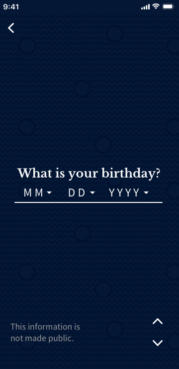
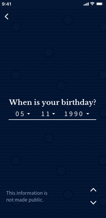
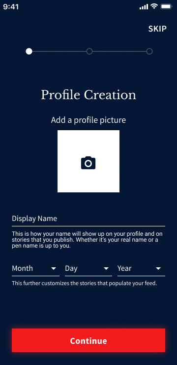
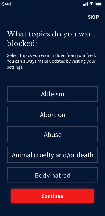
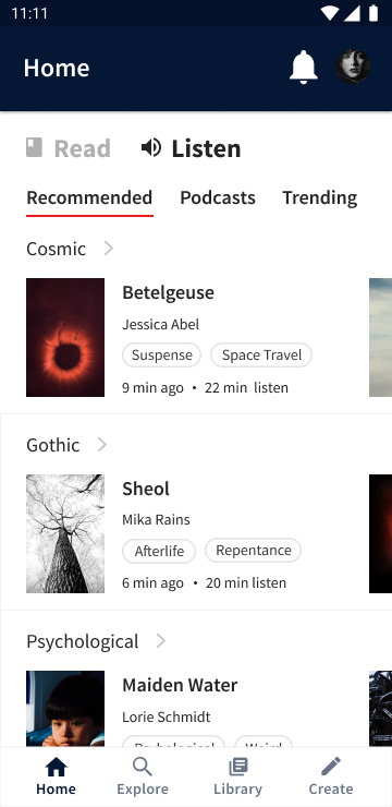
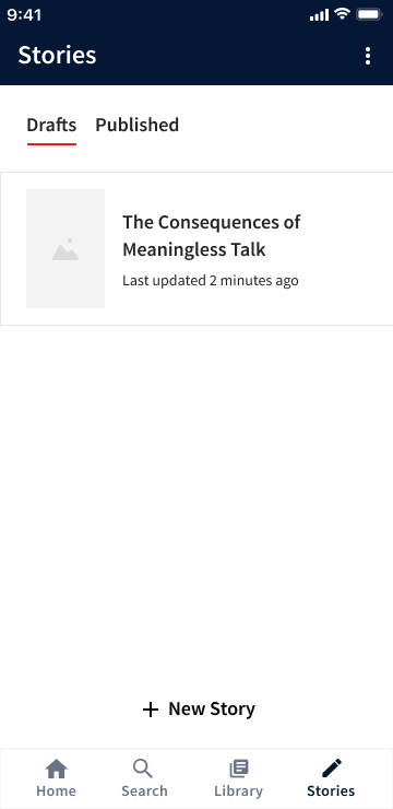
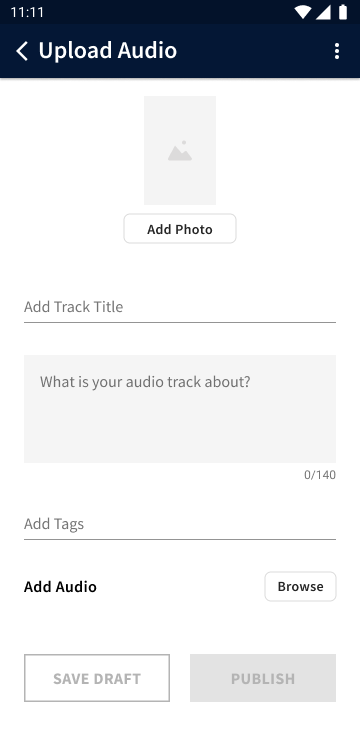
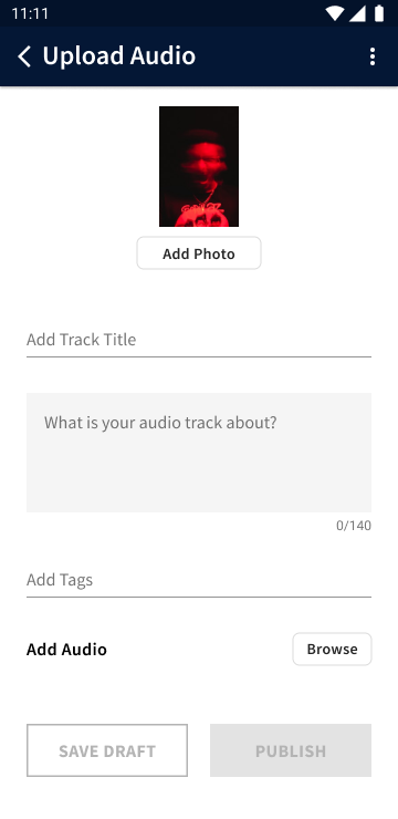
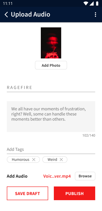
PROCESS > VISUAL DESIGN


Branding Work

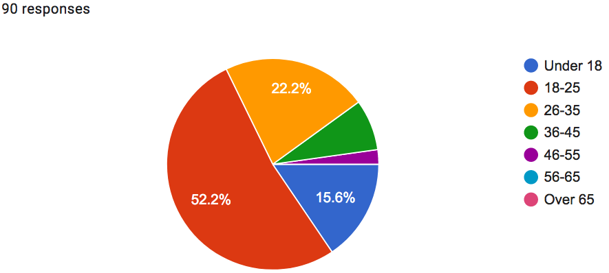
Looking back on my research, I did not want the branding for the app to 
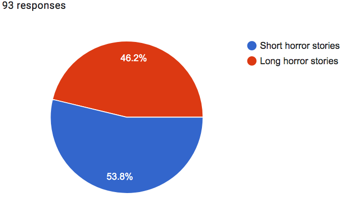
be outright terrifying. In the horror storytelling survey, I asked respondents what their least favorite type of horror was. The majority answered with "gore" and "slasher" horror, so I made a note to exclude visceral and violent imagery from branding. I assumed this to be the case, but it's great to have data backing me up.


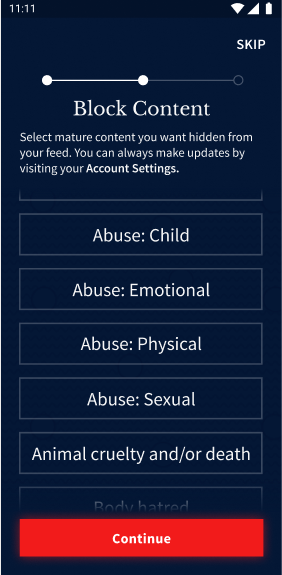
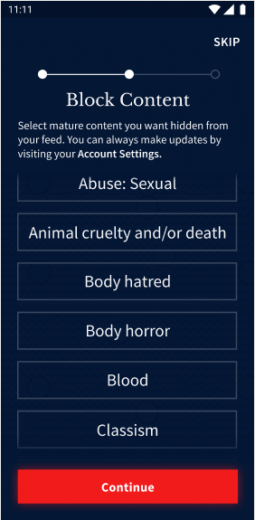
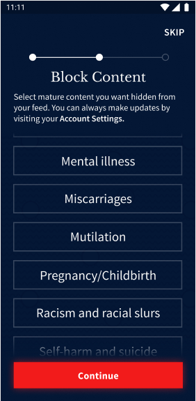
While the point of the app is to be a literary haven for horror lovers, it must function as a tool that introduces horror to those who have never sought it before. Such people would be children and those sensitive to visual horror. To make exploring the uncomfortable comfortable, I wanted to go for characteristics like weird and odd. In what ways could the app be offputting, yet inviting?


The Brand Name

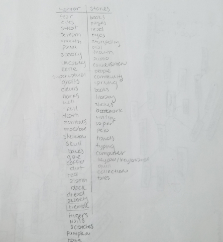
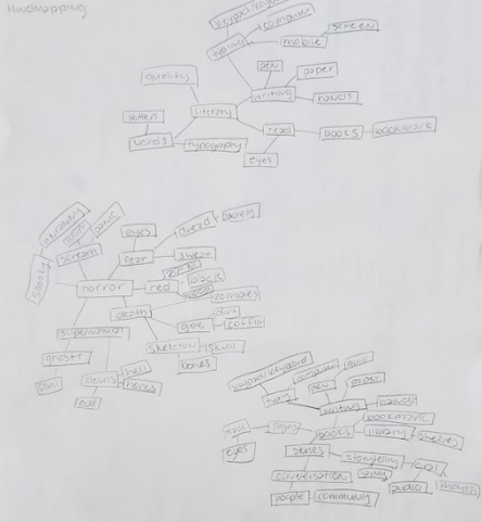
The first step I took with branding was coming up with a name. It was difficult at first. With all the listmaking and mind-mapping I did, I couldn't come up with a name that best represented the personality and purpose of the app. Every word I came up with sounded like something I heard before. I reached out to my friends and family, told them my issue, and they helped me brainstorm based on what I wanted the name to convey. 
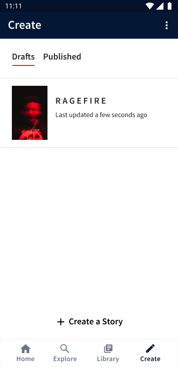
With their help, I decided on Tremble because of how it evokes a familiar feeling associated with experiencing discomfort, terror, horror, and repulsion.
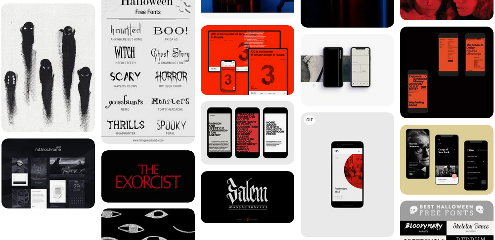


listmaking sketch

My sketched out list-making technique.

mindmapping sketch

My sketched out mind-mapping technique.


Moodboard

The moodboard I created had images from cinematic horror - vibrant blues, yellows, purples, greens, and reds that played significant roles in movies. I drew inspiration from horror comics, drawings, eyes, and cinema.
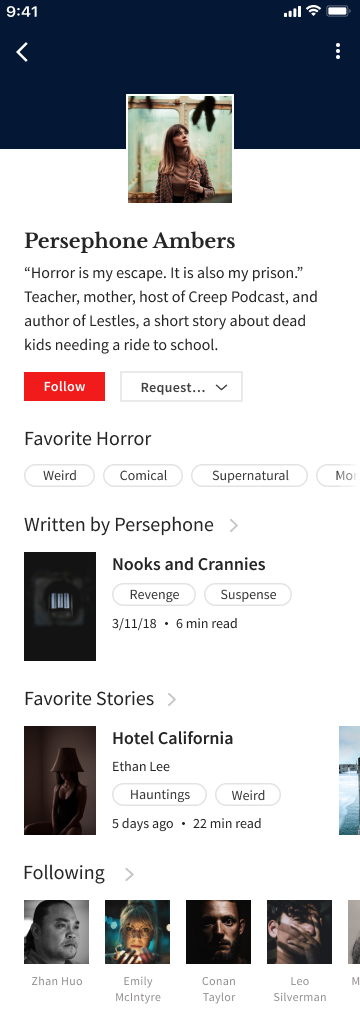
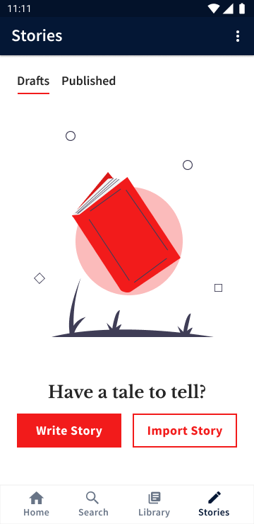
moodboard

I used Pinterest to create the moodboard for Tremble.


Brand Color

Because red is often associated with elements of horror – blood, evil, and anger – I attempted to try something different by checking out stills from horror cinema with excellent cinematography. I decided I would use green as my primary color, red as a secondary color, with black and white as my background colors. I chose green because instead of going for something outright horrific, I felt it would give Tremble a ghoulish vibe – enough to be considered creepy.


#31BF2C

#FFFFFF

#2B2B2B

#F21B1BF


However, I shared my reasoning with peers and my design mentor, and the feedback I received made me reconsider:


"The green makes me think of aliens."


"The green makes your LOGO look like an alien."


"I don't see horror, but I do see sci-fi."


"I'm reminded of toxins."


Not what I expected, but I decided not to fight the obvious. A dangerous, ominousness, bloody red was the way to go. Typical for the genre, but it gets the point across. I also replaced black with a dark navy, which is a bit softer and reminiscent of a night sky.
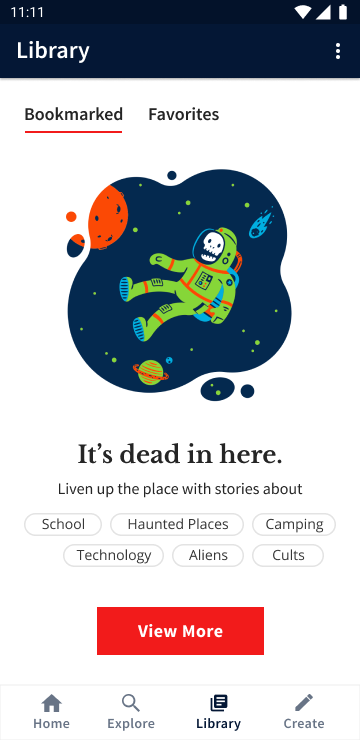

#F21B1B

#FFFFFF

#31BF2C

#8ED943


The Logo

I did a lot of brainstorming and sketched out different concepts for Tremble's logo. I wanted to incorporate eyes into the logo because the fear of being watched can creep up on someone invested in a good horror story. After going through many ideas and formats, I decided to create a logo mascot to pair with a logotype as the official logo.


I designed a variety of mascots using different looks and colors. After sharing the designs with others and getting feedback, I chose my winner.


 tremble logo in black and white

Tremble logo in black and white

tremble logo in color

Tremble logo in color

The Typefaces

I chose Libre Baskerville as the brand font because, while the Baskerville typeface has a history of being used in books, Libre Baskerville is more legible on digital devices. Source Sans Pro contrasts Libre Baskerville well and adds a modern touch when the two are paired together, creating a perfect pairing to uphold Tremble’s brand personality.

Mockups

I initially used Sketch to create my first round of high fidelity mockups for the clickable prototype. Using my paper wireframes as a guide, I designed refined, digital replicas in Sketch while applying the branding decisions I made earlier. It was here that I could examine whether my content strategy was successful or not, from my perspective at the time.


One thing I struggled with here was finalizing my color palette. Applying green as a primary accent color and red as a secondary accent color was not exhibiting the user experience I was trying to give. The palette was hard, and I received feedback that it was evocative of science fiction, toxins, and aliens – not a hint of the ghastliness I was trying to convey.


My desire to avoid using red as a primary color was getting in the way of the practicality of using what makes sense. Logic won in the end, and I decided to go with a nightly theme instead, replacing black with a dark navy and using red as the primary accent color.


It was also tough finding suitable visuals for empty states. There weren't many horror-related visuals out there, so I got creative with my UX writing to connect the visuals I chose with the app experience.


library screen in an empty state

The finalized library screen in an empty state, with visuals supported by narrative copy.


PROCESS > usability testing


Applying Feedback

I got a lot of good feedback after submitting my mockups to Bloc's Daily Design Critique (DDC), and received the following suggestions:

  1. 1. Add icons to the “Read” and “Listen” tabs

    tabs before iteration

    Listen and Read tabs before iteration, without icons.

    tabs after iteration

    Listen and Read tabs after iteration, with icons.

  2. 2. Redesign the user journey for signing up
    1. a. The fewer actions a user has to take at once to sign up, the better. Best to have all relevant information show up at once than separately.
    2. b. Currently, there are too many taps and screens than necessary for the user to build their profile.

    Create Account: Before Iteration – Create Account

    create account process, screen 1

    1. "What is your first name?"

    create account process, screen 2

    2. Insert first name

    create account process, screen 3

    3. "What is your last name?"

    create account process, screen 4

    4. Insert last name

    create account process, screen 5

    5. "What is your birthday?"

    create account process, screen 6

    6. Insert birthday

    Create Account: After Iteration

    create account process iteration

    Profile creation in a single-screen form

  3. 3. Add a progress bar to the onboarding process to show the user where they are in the process and how long it will take for them to finish

    Onboarding Process: No Progress Steps

    onboarding without progress bar

    Content blocking screen without indication of what step it is in the onboarding process

    Onboarding Process: Add Progress Steps

    onboarding with progress bar, screen 1

    Step 1. Create Account

    onboarding with progress bar, screen 2

    Step 2. Block Content

    onboarding with progress bar, screen 3

    Step 3. Topics of Interest

  4. 4. Add secondary text to explain to the user the importance of different actions during the profile building process
    secondary text before iteration

    Interest screen before iteration, with searchbar.

    secondary text after iteration

    Interest screen after iteration, without search bar (removed to simplify the onboarding process).

  5. 5. Make the saving option in the story editor visible instead of hidden in a dropdown
    saving before iteration

    The save option in the story editor, hidden in a dropdown under the "more" icon.

    saving after iteration

    The save option in the story editor, visible to the user but in a disabled state.

  6. 6. Add a content warning before introducing the Blocked Content screen
    1. a. One of the biggest reasons for Tremble is to help people become comfortable with being uncomfortable. With this in mind, I thought it necessary to include a blocking system to give users control over the content they see in the app. I didn't have time to expand on this and didn't want to put much focus on it in the MVP, but I did want to show the feature was available for use. I received feedback that it would be beneficial to give users a warning before they land on the "Block Content" screen with the option to skip it. I agreed to add it. The last thing I want to do is throw a user off the app before they make it through the onboarding process.
      saving before iteration

      Block content screen before adding content warning

      saving after iteration

      Blocked content screen after addinc content warning

After updating my mockups, I shared them with my mentor, who recommended I transfer them from Sketch to Figma for prototyping. It wasn't until I did this that I noticed how big the image files in my mockups were. They were pretty massive files, so I decreased their sizes and optimized them, which sped up the loading time of my project.


Usability Tests

I scheduled two in-person and three remote usability tests with five people after building my prototype. All testers considered the app intuitive and did not recommend changes, but as I observed them navigate the prototype, I noticed inconsistencies in my design.

Task List
  1. 1. Create an account on Tremble via email
  2. 2. Build your user profile
  3. 3. Block child abuse from your feed
  4. 4. Select cosmic, gothic, psychological, and supernatural as topics of interests
  5. 5. Find and select Waan’s Magic Mountain to read
  6. 6. Play the audio for chapter one of Waan’s Magic Mountain
  7. 7. Go to Waan’s Magic Mountain discussion board to write a comment on the story
  8. 8. Create a story
  9. 9. Find Persephone Ambers and follow her
  10. 10. Congrats! You have completed the test
  1. 1. Home Screen - Read vs. Listen Feeds
    1. a. None of the interests selected during the onboarding process were in the Listening section, making the content between the two inconsistent. I had to remove the content from under the listening tab and add stories related to the interests selected in the beginning.
    2. home screen before iteration

      Listening tab before iteration

      home screen after iteration

      Listening tab after iteration

  2. 2. “What’s the difference between child abuse and abuse?”
    1. a. When testers were asked to block child abuse from their feeds, they all selected “Abuse” instead. It was the first thing they saw before curiously scrolling down to find “Child Abuse” as an option. Should the two remain separate? If so, how could I further define them to avoid confusion?
    2. blockable options screen

      Inclusion of only abuse and child abuse before iteration

      blockable options screen

      Inclusion of types of abuse after iteration

  3. 3. Include “body horror” and “mutilation” as options to be hidden by users
    blockable options screen

    Inclusion of body horror as a blockable option

    blockable options screen

    Inclusion of mutilation as a blockable option

  4. 4. Allow users to customize their profiles with visuals
    1. a. The solid banner I used to differentiate the navigation from the rest of the page was mistaken as an "empty space" by a tester, who suggested an opportunity for user customization. While I want the app design to be consistent for all users, I did like the idea and applied it. IF I had more time, I would have liked to gather more opinions on adding such a feature.
    2. user profile without customization

      User profile without customization

      user profile with customization

      User profile with customization

  5. 5. Change “Stories” to “Create” and “Search” to “Explore”
    1. a. During the user survey, it took testers a moment to figure out where to go to create a story. While clicking the "Story" tab in the bottom navigation was the right direction for completing the task and eventually where testers ended up, they initially assumed this path would lead to more stories.

      Realizing this miscommunication, I revisited the bottom navigation and changed "Stories" to "Create." I also changed "Search" to "Explore" because it better communicated the purpose of the screen linked to it.
    2. bottom navigation before iteration

      Bottom navigation with "Search" and "Stories" before iteration

      bottom navigation after iteration

      Bottom navigation with "Explore" and "Create" after iteration

Assessment Feedback

After I updated the clickable prototype, I presented my project to a senior designer. With the feedback I received, I decided to refine the user experience for creating a story on the app. My assessor's recommendation was that I create two separate paths for publishing content – one for written content and one for audio content – because the option to upload a story was not immediately visible to the user with the "Write Story" button.

Create Story: Before Iteration

create story before iteration, screen 1

1. Stories screen's drafts tab in empty state

create story before iteration, screen 2

2. Story details screen in empty state

create story before iteration, screen 3

3. Story details screen with inputs

create story before iteration, screen 4

4. Story editor screen in empty state

create story before iteration, screen 5

5. Story editor screen in used state"

create story before iteration, screen 6

6. Stories screen with saved story under drafts tab

Create Story screen: After Iteration

create story screen after iteration

1. Updated create story screen with draft tab in empty state

create story screen after iteration, with option to write a story or upload audio

2. Updated create story screen, with option to write a story or upload audio

Write a Story Proccess

write a story after iteration, screen 1

1. Story details screen in empty state

write a story after iteration, screen 2

2. Story details screen with inputs

write a story after iteration, screen 3

3. Story editor in empty state

write a story after iteration, screen 4

4. Story editor in used state

write a story after iteration, screen 5

5. Updated create screen with saved story under drafts tab

Uploaded Audio Proccess

upload audio after iteration, screen 1

1. Story details screen in empty state

upload audio after iteration, screen 2

2. User's mobile gallery, photo upload

upload audio after iteration, screen 3

3. Story details screen with uploaded photo

upload audio after iteration, screen 4

4. Story details screen with inputs

upload audio after iteration, screen 5

5. Updated create screen with saved story under drafts tab

If I had more time to expand more on the project, I would have loved to create a website design prototype as well. I decided on a mobile-first approach because, based on my research, having a mobile prototype would meet users' needs. However, I was also aware that having an online version of Tremble would be essential to its success as a self-publishing platform. I assumed users would rather type out stories on a PC instead of mobile, so having a website version of Tremble to show would have been a nice touch.


Some of my original user stories did not make it to the mockup stage. I did not want to overwhelm myself with unessential features that did not have to be included in the MVP for it to be complete. If I had more time, I would have liked to expound on the following:

  1. 1. Refine the explore page by adding sorting and filtering features
  2. 2. Added a collaborative system for translating stories
  3. 3. Include user stories for an editor-type user
  4. 4. Add manage account and edit profile processes
  5. 5. Do more testing and research

Instead, I chose to focus on designing a prototype that allows for the following tasks to be completed:

  1. 1. Self-publishing written and audio content
  2. 2. Reading and listening to stories
  3. 3. Discussing stories with others
  4. 4. Personalizing the user experience
  5. 5. Allow users to gain exposure and acquire a following

As a horror fan, I enjoyed working on this project. It gave me a chance to explore a problem I am familiar with and attempt to solve it by applying what I’ve learned as a student apprentice at Bloc.