Ark

Ark is a conceptual interactive prototype for users wanting to store, share and create content on a single secure platform. Safe sharing and collaboration with others is administered via private-encryption, heightened password security, and content monitoring.

ark mobile preview

As more individuals and businesses become reliant on cloud storage providers to store their content, the risk of doing so increases with the lack of essential cybersecurity features on even the most popular cloud storage services. In this project, I shed a light on these concerns by designing an app that makes such features available to users interested in effectively securing and monitoring their content, while also giving them the ability to create content and safely collaborate with whomever they choose.

Roles
  • UX Designer

  • UX Researcher

  • Visual Designer

  • Content Strategist

Deliverables
  • Competitive Analysis

  • User Survey

  • User Personas

  • User Stories

  • User Flows

  • Style Guide

  • Lo-Fi Wireframes

  • Hi-Fi Mockups

  • Clickable Prototypes

  • Usability Test Report

  • Preference Test Report

  • First-Click Test Report

Tools
  • Sketchbook

  • Sketch

  • Figma

  • Invision

  • UsabilityHub

  • Craft

  • Maze

  • Draw.io

  • Zoom

  • QuickTime Player

The core of the problem was to create a cloud storage app that allows for collaboration with others. However, before doing so, I needed to clarify how this app could alleviate existing problems that aren’t being addressed well by competitors or could be approached in a different, yet effective, manner.

By analyzing competitors (Google Drive, Box, and Dropbox) and doing user research, I discovered that there was a need for collaboration-friendly cloud storage services prioritizing user safety with the inclusion of features such as private-encryption, heightened password security, and content monitoring. The app should address these concerns in addition to being a stress-free space for creation, collaboration, and the sharing of content with others.

PROCESS > STRATEGY


Competitive Analysis

To find the appropriate target audience for this app, I had to learn more about the competition (Google Drive, Box, and Dropbox).

  1. 1. What is their purpose, and what do they represent?
  2. 2. What do they consider their best features?
  3. 3. How do their users perceive their services?

After some secondary research, I quickly found enough information to compare competitors. My resources include competitor websites, user reviews, and comparison articles.

checkmark

Collaborate with others by sharing access to files up to 5TB with anyone, even if they don’t have a Google account

checkmark

Have control of permissions such as view, comment or edit to prevent multiple versions and file merging

checkmark

Multiple users can work on the same Google Docs, Google Sheets
or Google Slides file in real-time

checkmark

Files can be accessed from PC, tablet, or smart phone

thumbs down

Can be difficult to determine which files are taking up storage space

thumbsdown

No passwords or expiration dates for share links

checkmark

Increases the ability to collaborate with others, individuals, teams,
 or work departments

checkmark

Grant user access with limited or unlimited permissions

checkmark

Referrals provide users with extra storage space

thumbsdown

Only 2 GB of free space

thumbs down

No chat feature

thumbsdown

No way to upload files to or from the Dropbox app

thumbsdown

Files can’t be worked on simultaneously or two copies will be made; can only synchronize what is inside the folder that is created automatically

checkmark

Can password-protect individual files

checkmark

Can set expiration dates for shared folders

checkmark

Live online training, pre-recorded tutorials and white papers to assist users in becoming familiar with interface and features

thumbsdown

No way to prevent users from working on the same file simultaneously, which can lead to work-loss

thumbs down

Mobile app too limiting for admin users

thumbsdown

Inability to share individual documents to non-registered users for editing

User Survey

Reading user reviews on each competitor notified me of customer attitudes toward certain product features. This information and my prepared SWOT analysis guided my creation of a user survey that would spotlight features that were essential enough to include in the MVP. I dispatched the survey on Reddit’s r/SampleSize and Bloc’s various Slack channels. I hoped to find answers to the following questions with the survey:

  1. 1. Why do respondents use cloud storage?
  2. 2. Which cloud storage features have benefitted respondents?
  3. 3. Which cloud storage features are most important to respondents?
  4. 4. Which collaboration features are most important to respondents?
  5. 5. What are the motivations and goals of respondents when using cloud storage? Have they been achieved?

Within the 72 hours following its dispersion, 23 respondents completed the survey.

HIGHLIGHTS
  • 1. All respondents have used Google Drive in the past

    pie graph
  • 2. Most respondents use cloud storage to achieve personal goals

    bar graph
  • 3. Respondents consider uploading content and creating content the most important features to have on a cloud storage app

    pie graph
  • 4. Overall, respondents consider the ability to share items and folders the most essential collaboration features to have on a cloud platform

    bar graph

Respondents consider the following features to have high-importance on a cloud storage app, rated from highest to lowest importance:

  1. 1. Manage file permissions
  2. 2. Sync across devices
  3. 3. Comment on documents
  4. 4. Password protection on files
  5. 5. Real-time collaboration

Respondents’ motivations for using cloud storage include:

  1. 1. A safe and convenient alternative to internal/external
 hard drives
  2. 2. Effortless sharing of content with others
  3. 3. Free up space from devices and store large files
  4. 4. Accessibility

Goals respondents hoped to achieve with cloud storage include:

  1. 1. Improve productivity and collaborate with others
  2. 2. Access files from any device
  3. 3. Store files in one place
DEMOGRAPHICS
  • 1. 87 percent of respondents were 18-35 years of age, with over half being in the 18-25 range

    pie graph
  • 2. About 35 percent of respondents are students

    bar graph
  • 3. A majority of working respondents work in marketing and tech fields

    pie graph

User Personas

The demographic data gathered from the user survey reveals that respondents come from a variety of different backgrounds. I narrowed down on the appropriate target audience for my app by focusing less on whom the respondents are and more on the nature of who they are. By doing so, I produced the following personas:

Persona #1 | The Collaborator

AALIYAH SMITH

STUDIOUS COLLEGE STUDENT

DEMOGRAPHIC

Age

18-25

Occupation

Student

Location

San Antonio, TX

Gender

Female

Tier

Free User

“I want cloud storage that allows me to easily collaborate with others and provides me with enough storage space and security to do so.”

Bio

Now in her senior year of college, Aaliyah has a lot to keep up with. Her final academic year is littered with group projects, accompanied with an intensive capstone and intimidating exams that require endless note-taking and concentration. If she’s going to survive the year, she’ll need to worry less about studying harder and instead study smarter. Aaliyah likes to keep track of her life by journaling each day and does candid photo-taking in the city.

Motivations

Aaliyah has had a Google account for quite some time now and a majority of her peers have one too. Always collaborating with other students, she takes class notes in real time with her peers while class
is in session. Using cloud storage has also allowed her to keep all of her documents in one place without having to worry about carrying around an external hard drive to free up space on her own computer,
 Chromebook. However, the lack of private encryption will become an issue in the future as soon as she begins her professional journalism career.

Goals
  • Real-time collaboration with other students
  • Have enough space to house school-related and personal documents
  • Store files and backups with the option of sharing them with others
Frustrations
  • Not enough storage space
  • No private encryption for files

Persona #2 | The Team Lead

MIRANDA LAWSON

CONSIDERATE SUPERVISOR

DEMOGRAPHICS

Age

26-35

Occupation

SEM Manager

Location

New York City, NY

Gender

Female

Tier

Enterprise User

“I’m in need of cloud storage that is not only accessible to anyone from any device but allows for big file shares and is built around collaboration in businesses.”

Bio

If Miranda could describe her life in three words, they would be “Busy, busy, busy…!” Single and without kids, she remains career-focused with her eyes always on the prize – success! As an SEM manager at a Fortune 500 company, she is adamant on becoming its number one asset all while nurturing her team by using strategies that allow them to fulfill their potential through collaboration. Her hobbies include boxing, painting, and watching Meryl Streep movies on the weekends with her sister.

Motivations

Miranda does what she can to make sure her and her team stays on top of tasks and meet deadlines. Almost half of her ambitious underlings work remotely and they need to has access to whatever documents they need to fulfill their responsibilities. While they currently use Box, Miranda is looking into transitioning to an intuitive platform that is built for collaboration on a business level with storage security in mind.

Goals
  • Decrease risk of losing important files
  • Manage permissions and encryption of files
  • Access files anytime from any device
  • Keep all files in one place
  • Share big files without a problem
Frustrations
  • Lack of collaboration tools accessible to those without Microsoft Office
  • Can’t simultaneously collaboration without risking data loss
  • Limited admin management on mobile devices
  • Can’t share files to edit with non-registered users

Persona #3 | The Content Hoarder

JERVINE KAPOOR

TECH-SAVVY FREELANCER

DEMOGRAPHICS

Age

26-35

Occupation

Game Developer

Location

Chicago, IL

Gender

Male

Tier

Paid User

“I want cloud storage that give me enough bang for buck. I’m not interested in paying for unnecessary features and want to invest in a service tailored to my needs.”

Bio

Now that Jervine has enough professional experience to work successfully as a freelancer, he is excited about finally taking on new projects that are of most interest to him alongside his wife, a concept artist and fashion designer. The two tag-team with raising their imaginative 3-year-old daughter who has no problem with modeling her mother’s cosplay creations. Jervine’s hobbies include practicing code, eSport dates with his wife, and being an attentive father.

Motivations

As both a parent, freelancer, and gamer Jervine is in need of a lot of cloud space but only wants to invest in what can be used. Too many providers on the market either provide too little or too much storage space and he would prefer to upgrade when necessary. Instead of using multiple platforms at once, he would rather have the same provider store his data.

Goals
  • Syncing between devices
  • Dependable file backup and recovery
  • Attaching files from storage to email
  • Manage permissions
  • Improve productivity
Frustrations
  • Space limitations
  • Lack of private-encryption cloud storage providers
  • Not many services capable of block-level file transfers

PROCESS > Information Architecture


User Stories

User stories were derived from the motivations, goals, and frustrations of the user personas and revealed specific tasks users should be able to complete in the app to meet their needs. After recording them in a spreadsheet, I prioritized them based on importance. This practice helped me keep scope creep at bay throughout the entire process.

Role Tasks Importance
New User Create an account High
New User Explore platform High
Returning User Log into account High
Returning User Manage account High
All Users Upload files to the cloud (videos, images, PDFs, etc.) from a computer or mobile device High
All Users Share a single item or folder in the cloud with others (and vice-versa) High
All Users Create content that will be saved to the cloud (notes, documents, spreadsheets, etc.) High
All Users Sync files across computers, tablets and/or smart phone devices High
All Users Manage file permissions and passwords for files and/or folders Medium
All Users Collaborate with others on documents in real-time Medium
All Users Make comments on documents shared with collaborators Medium
All Users Access files in the cloud while online or offline through smart phone and/or tablet Medium
All Users Check inbox for notifications and/or messages
from collaborators Medium
All Users Save content found on web Low
All Users Enable or disable synching between devices Low
All Users Get assistance from technical support Low

User Flows

User flows illustrate the many paths a user can take when navigating the app’s interface. They are also a great measure of how efficient and expansive the MVP should be. I referenced back to them often throughout the wireframing process to keep me on track.

Wireframes

Giving my strategy a skeleton let me analyze my interpretation of research results and expose any cracks in the framework that needed redressing. Sketching concepts out on paper allowed me to focus on hierarchy and rapidly sort through various layout ideas at a time. The simplicity of sketching prevented me from lingering on distracting details that come with digital wireframing or immediately designing hi-fi mockups. Once finished, I fleshed out my wireframes in Sketch and then organized them into a clickable prototype.

SHARE ITEM & MANAGE PERMISSIONS

wireframe sketch

My sketch for "sharing an item and managing permissions."

The user flow for sharing an item and managing permissions would go as follows:


PROCESS HIGHLIGHT

To Tutorial or Not Tutorial?

Before running usability tests on my lo-fi prototype, I pushed it through two sessions of Bloc's Daily Design Critique (DDC). At this point, the prototype had an empty state encouraging the users to upload or create a file to get started.

user flows

The original wireframe for Ark’s dashboard empty state before receiving feedback to make it more directional.

In the first DDC, I was made aware that a user inexperienced with cloud storage interfaces may be in need of a walk-through for their first interaction. With this in mind, I designed more wireframes that welcome users to the app and give them access to a tutorial.


I then sent the updated prototype to be reviewed for a second time. The reviewer was not the same person, and the tutorial received a response that somewhat contradicted the feedback I embraced earlier. After completing the onboarding process, he was greeted with a welcome screen asking if he would like to proceed to the tutorial.


“Oh no, a tutorial!” he nervously exclaimed.


Hearing the anxiety in his voice was enough for me to reconsider how I introduced the tutorial. It would need to be presented passively and not in the form of an assertive pop-up. I didn't want users to stop using the app because they assumed the interface is complex or had a high learning curve. For now, I would remove the tutorial to test the usability of the site and would address the problem after testing.

Usability Test I

I ran four usability tests on the low-fidelity prototype (two in-person, two remote) and received the following feedback from participants:

  • The dashboard is reminiscent of Google Drive, so much that testers' first instinct was to drag files across the screen when asked to place it into a folder. Unfortunately, this is not achievable in Invision, so they had to think for a moment before clicking elsewhere.
  • Highlighted features in the tutorial were perceived as clickable, although they weren’t
  • A tester liked that all pages are accessible from the dashboard

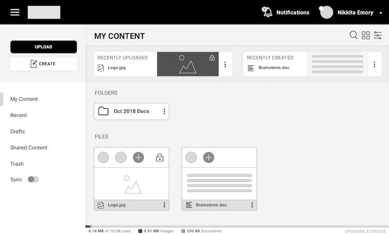
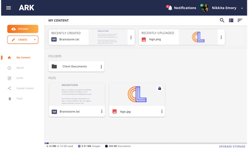
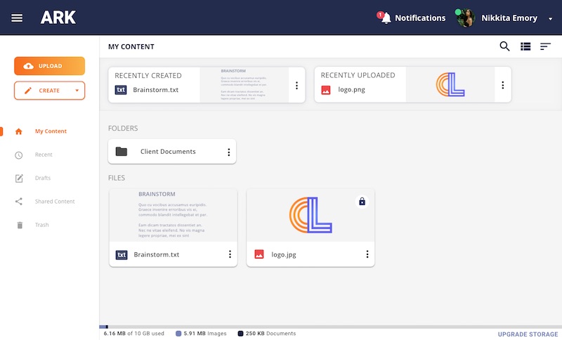
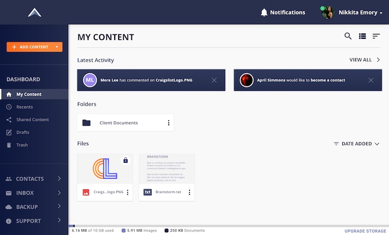
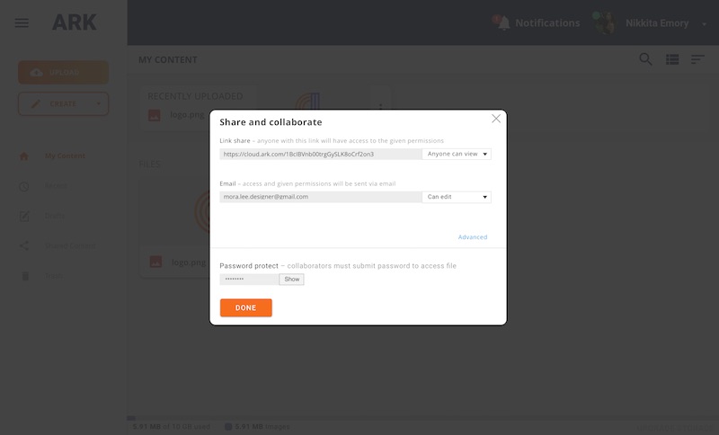
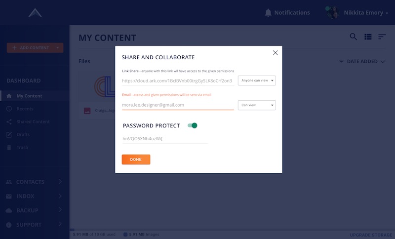
PROCESS > VISUAL DESIGN


Branding Work

I revisited the competitive analysis to determine the best positioning for the brand. My research showed me that positioning my brand as a solution to an ever growing problem in cybersecurity would be the best strategy.


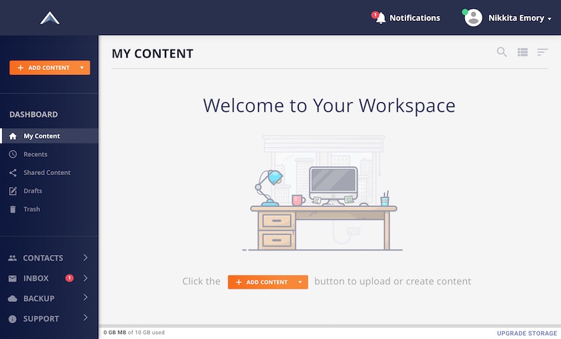
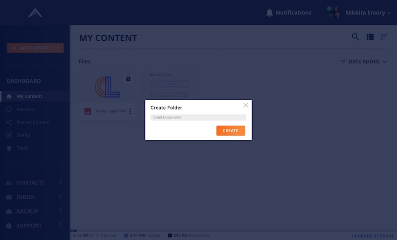
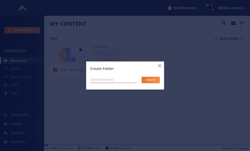
Next, I had to create a brand identity reflecting the app’s attention to cybersecurity and its collaborative features.


list making sketch

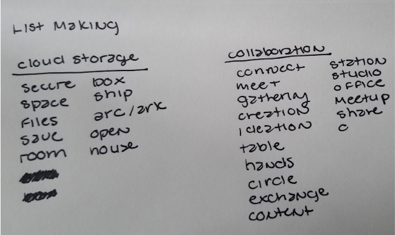
My sketched out list-making technique.

mindmapping sketch

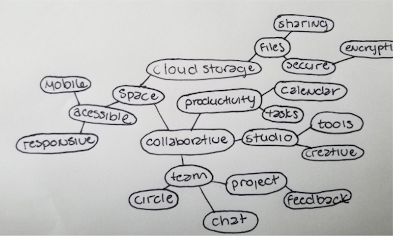
My sketched out mind-mapping technique.

The Brand Name

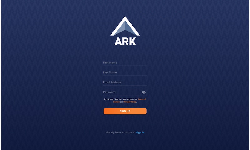
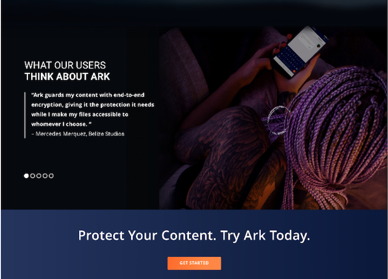
I chose “Ark” as the brand name because it means “large box,” which is appropriate for describing a secure cloud storage system. It can also mean “a place of refuge.”


The Logo

I originally wanted to take advantage of ark’s homophonic counterpart, “arc,” and use it in branding. However, I chose to use a triangular arch instead. The triangle is considered the most secure shape and its form embodies the brand’s focus on security.


first logo sketch

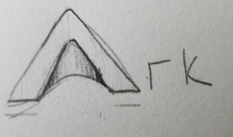
The chosen logo concept, a metallic arc.

second logo sketch

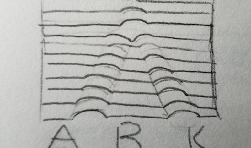
An arch formed from a stripped silhouette.

third logo sketch

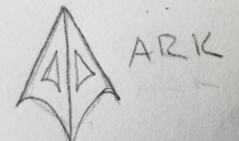
A space ship in the form of a three-dimensional “A”.

After sketching out many thumbnails, I landed on a few favorites. I chose to use the first thumbnail sketch because it had a structure that could work on both small and large scale mediums. Based on feedback from my mentor, I separated the graphic logo from the text for flexibility.


Moodboard

Cloud storage gives people access to a much larger space beyond their hard drives. I wanted to reflect this by utilizing the idea of "the cloud" and space, both from a cosmic and design perspective. The mood board presents many colors, contrasts, and vibrancy, all of which were influenced by nebulae suspended in space and the spectrum of colors produced from the sun as it aligns with Earth's horizon.

moodboard

The moodboard I created via Pinterest to pinpoint the aesthetic for Ark’s branding.

Logo Refinements

Logo concepts were sketched on paper first. Then, I chose what I considered the best design and digitized it in Figma.


logo refinements

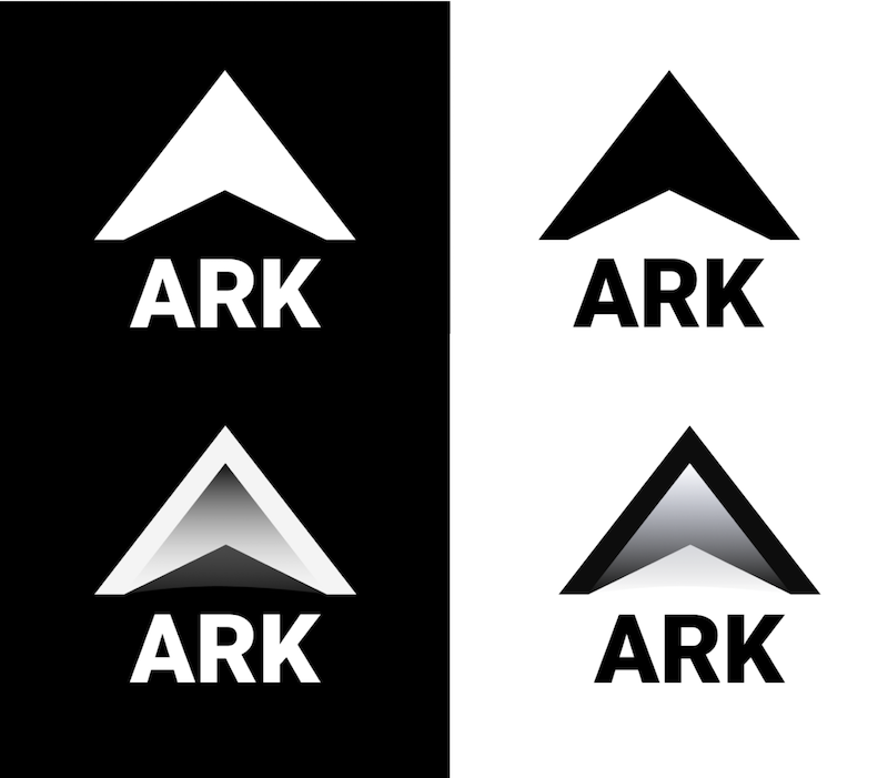
Black and white logos I created for Ark. I used a gradient to help me enivision how color would affect the logo when added.

Brand Color

I assigned blue as the brand’s primary color after doing some research into color psychology. Often associated with trust, responsibility, and security, this was the color that aligned with the personality of the brand best.


added brand color

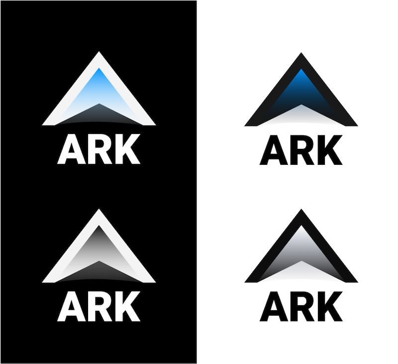
This is the logo with a potential brand color applied. I would later opt for a flatter design, but the ideas was for the logo to resemble the blue light often associated with cybersecurity.

The Right Color Palette

Choosing a color palette for the brand took contemplation and experimentation. I had a specific look in mind, but what I brewed up in color scheme generators would not suffice. After suffering through enough trial and error, I tried an alternative method. I extracted colors from the mood board I created for the project and made a few gradients.


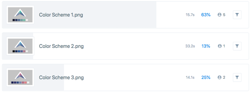
Here are the results:


color scheme

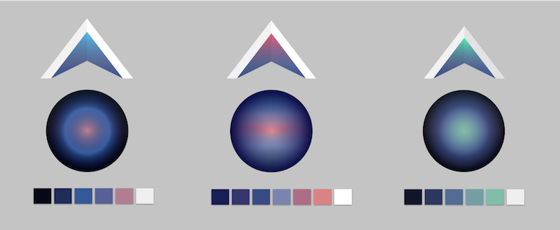
The top three color schemes I created for Ark.

“What do the spheres have to do with anything?”


Creating gradients in spheres made it easier for me to discern how well the colors flowed into each other, especially when comparing accent colors and background colors to one another.


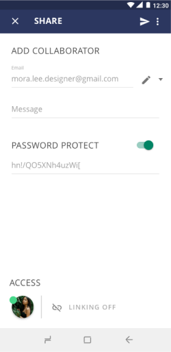
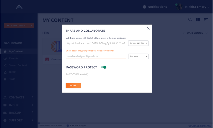
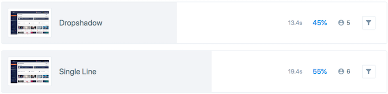
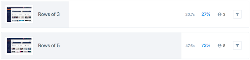
Next, I ran a preference test on UsabilityHub to see which one expressed characteristics of the brand best. I received the following feedback:


Which of the following color schemes best illustrates security, trust, inspiration, creativity, and wonder?

color scheme preference test
TAKE PREFERENCE TEST

The Deal with Gradients

At first, I assumed gradient logos didn't have many drawbacks when designed properly, but thanks to the feedback received from my preference test, DDC, and additional research, I changed my logo for the following reasons:

  • Gradients don’t always transfer well on digital mediums and don't always work well on print
  • Scaling down would remove the accent color in the logo from sight


ark logo in black and white

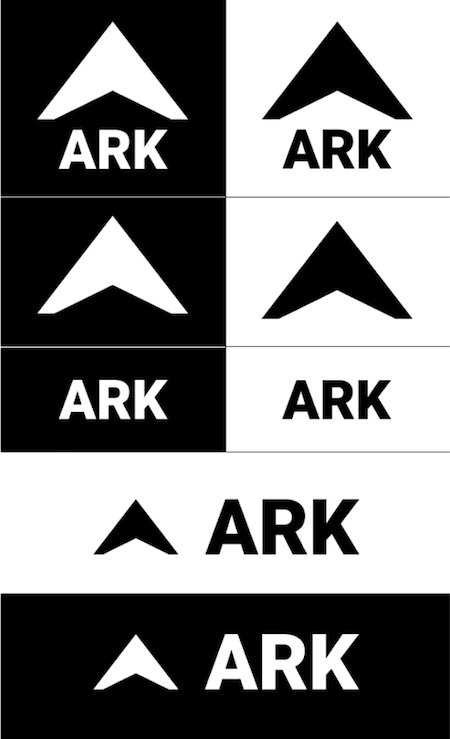
Logo Variations - black and white.

ark logo in color

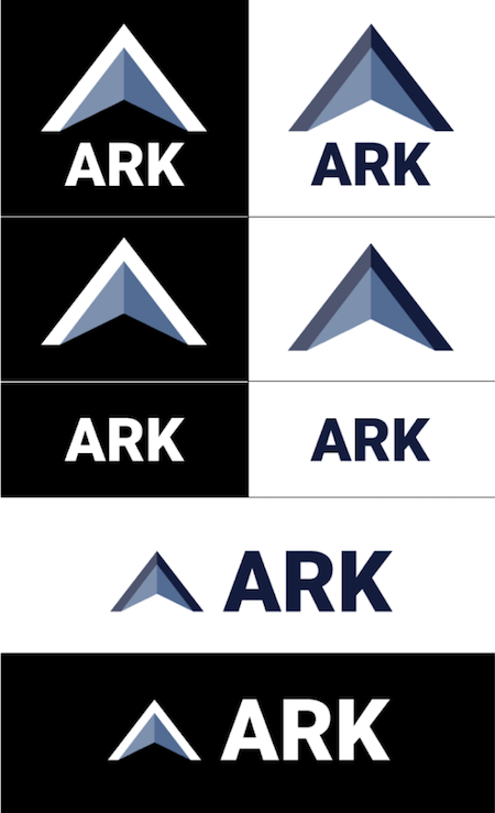
Logo Variations - in color.

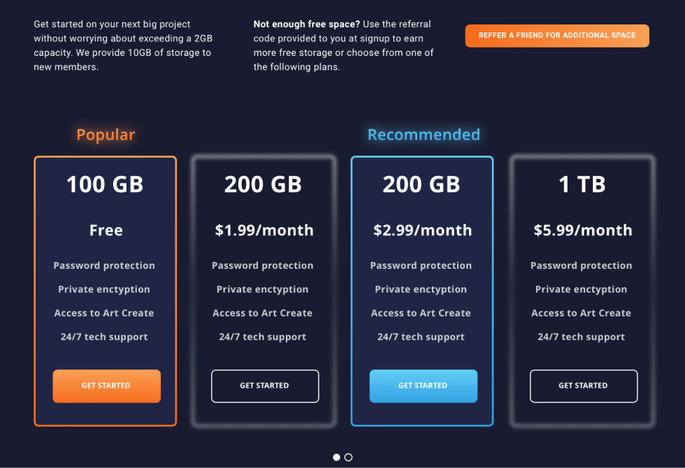
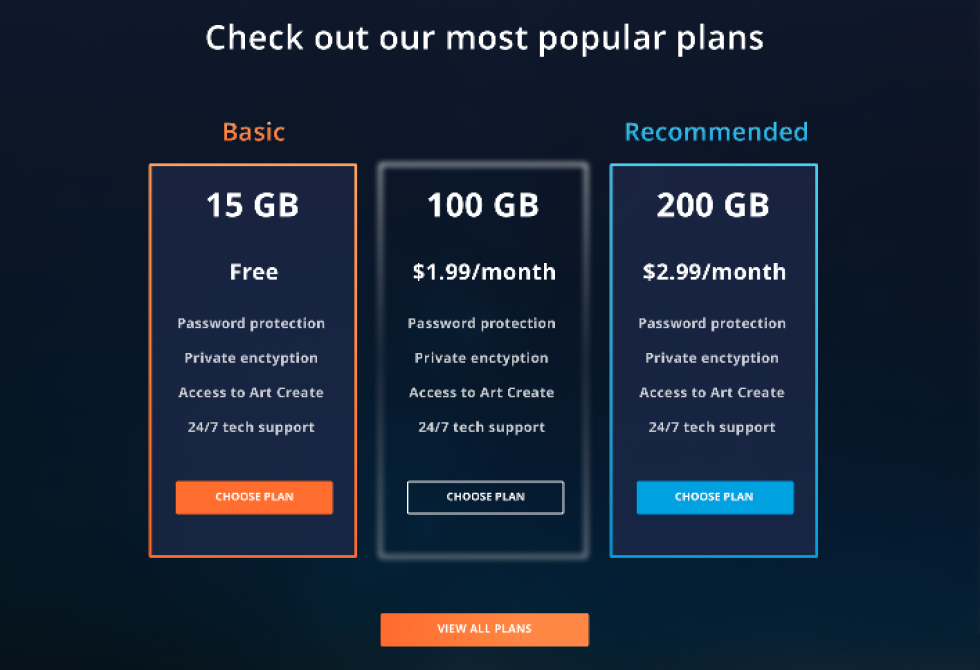
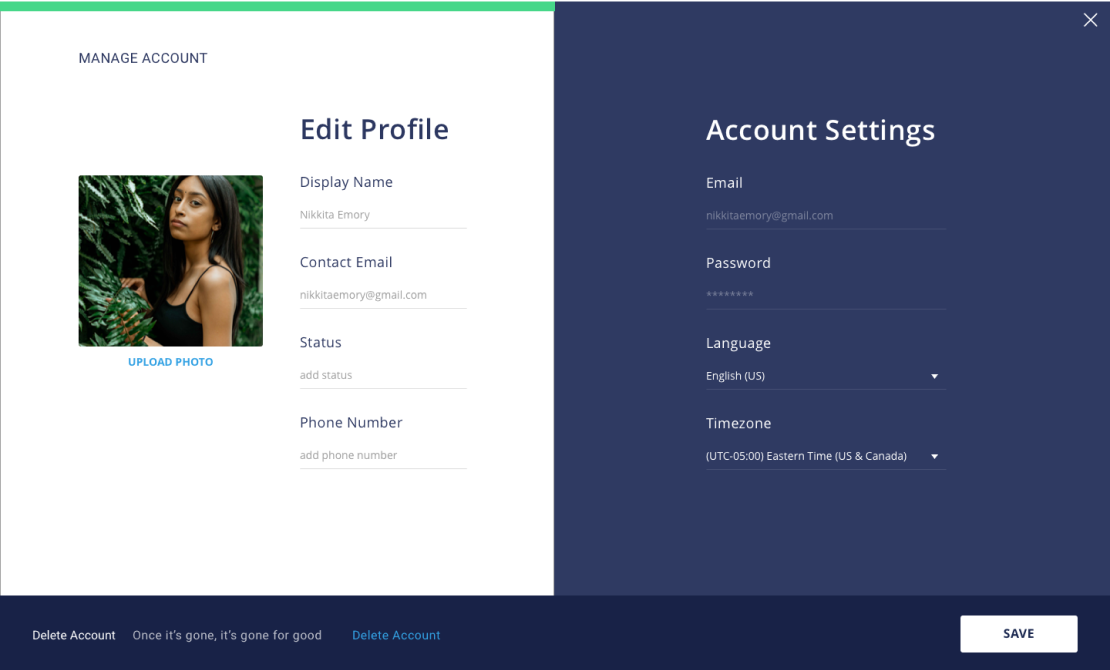
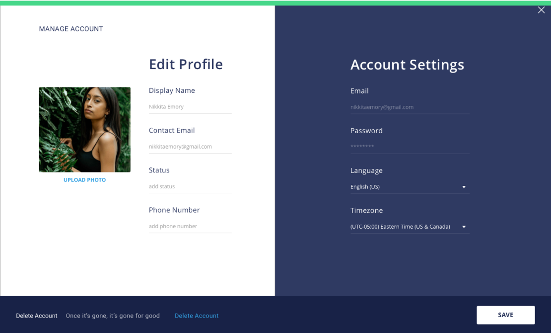
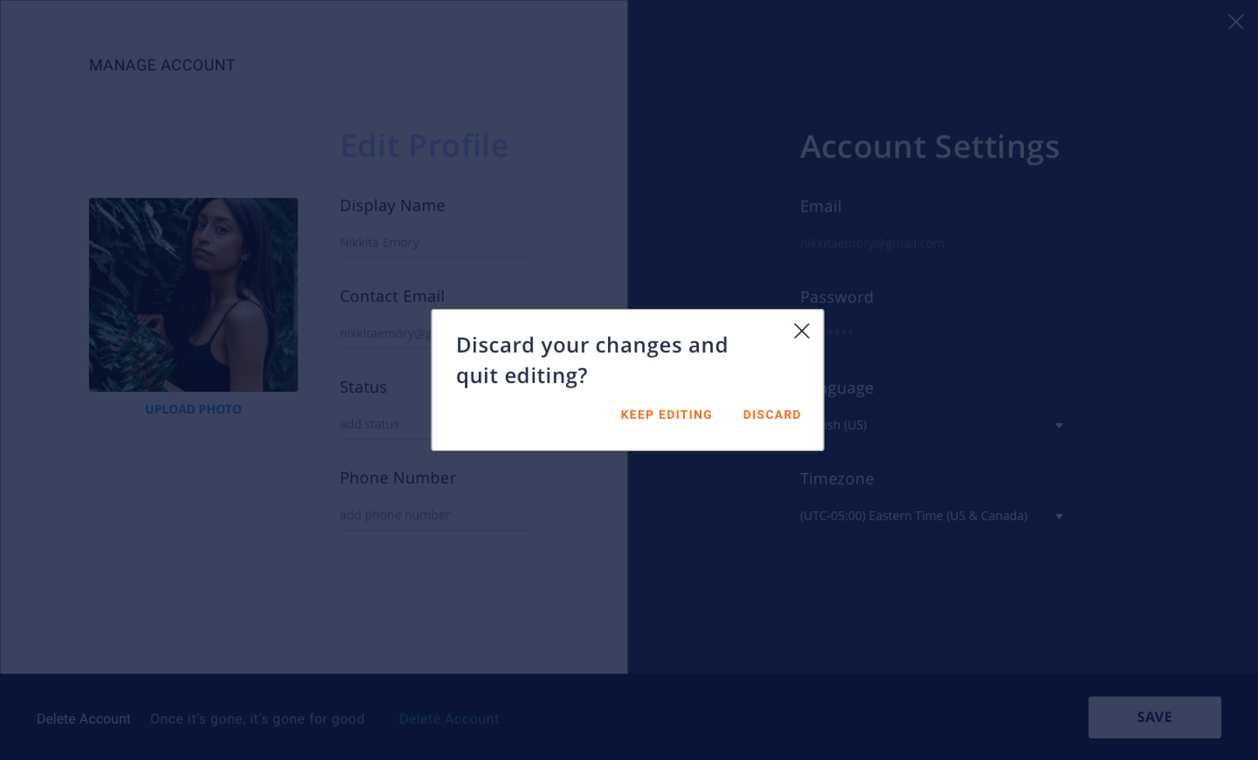
Updates to the Color Palette

I experienced some challenges when designing my hi-fi mockups with the heavily blue color palette voted on by testers. The light green primary buttons weren’t as prominent as I would have liked against navy backgrounds, especially the homepage. It was too monochromatic and needed a pop of color to add warmth and vibrancy to the design. After taking a gander at the color wheel and checking out its psychological properties, orange became the secondary color.


Finding the Right Type

I chose Roboto Black as the brand typeface and Open Sans as the complementary typeface because of how well the two complements both the weight and personality of the brand and logo. Roboto Black mirrors the structure and weight of the logo and is also a balanced collaboration of different moods – it’s modern and warm, not too cold or geometric. Open Sans makes a great partner for Roboto because it contrasts Roboto Black in both weight and width.


Challenges with Developing a Brand Identity

The most challenging part of this phase was understanding the cybersecurity threats to cloud storage services and developing a brand from my limited knowledge. I had to ensure the problem I present through my branding was accurate and would make sense to the public. More research was necessary.

PROCESS HIGHLIGHT

Updates Made To The Framework

I submitted my wireframe prototype into a couple of DDCs before creating mockups and made the following changes:


Homepage
  • Change the headline
    • Fear mongering isn’t the most sincere way to entice someone to use your product.
headline before changes

Ark’s homepage hero in the wireframe stage.

headline after changes

Ark’s homepage hero in the mockup stage.

Onboarding Process
  • Remove Google as an onboarding option
    • Branding stressed the importance of password security, and doing this would give Ark more control over password requirements.
  • Remove top navigation and image placement
    • The homepage has led them to sign up, so there is no need for an about page.
sign up before changes

Ark’s sign-up page in the wireframe stage.

sign up after changes

Ark’s sign-up page in the mockup stage.

  • Consistent with top-bar navigation
    • Allows for an icon-only closed state for the menu.
dashboard before changes

Ark’s dashboard navigation the wireframe stage.

dashboard after changes

Ark’s dashboard navigation the mockup stage.

Cards
  • Remove collaborator previews shown for each file
    • The app should be simple and easy to run. Instead, I would move the preview to the share window for each item.
cards before changes

Cards on the dashboard in the wireframe stage.

cards after changes

Cards on the dashboard in the mockup stage.

Mockups

Applying the Brand Strategy and Other Changes

After completing my first round of mockups, I had them reviewed in DDC and received additional feedback:

  • Decrease the lightness of the primary buttons
  • Somewhat difficult to read the text in the sidebar navigation
  • Highlight the three most popular plans on the homepage
payment plans before changes

Ark’s Payment Plans section on the homepage before changes.

payment plan after changes

Ark’s Payment Plans section on the homepage after changes.

  • Add testimonies/reviews with a final call to action


testimonial section

The testimonial section added after critique.


PROCESS > ADDITIONAL TESTING


Applying Feedback

In the original design, the hamburger button was used to toggle the sidebar navigation. The Ark wordtype was placed next to it for the user to recognize the platform they are using at a glance.


I did not use the brand type because it did not align well with the hamburger button. After expressing this to my mentor, he suggested I use the brand type to replace both the hamburger button and the word type. This way, I could exhibit the brand type in the app and have it toggle the menu at the same time.

payment plans before changes

Dashboard’s empty state before iteration.

payment plan after changes

Dashboard’s empty state after iteration.

Learning the hamburger button wasn't mandatory was a relief. Making the change boosted the confidence I had in my design. It was coming together!


One of the DDC panel members had difficulty reading texts in the sidebar navigation links and some modal windows due to their size. I increased their sizing to make the app accessible to those with impaired vision.

modal window text field before changes

Create Folder modal window before iteration.

modal window text field after changes

Create Folder modal window after iteration.

Update the Sorting System

Sorting systems play a vital role in the user experience. I did not plan to have it tested in my prototype, but sorting should always be efficient. The original design did not illustrate that.


Replace “Recent Activity” with “Latest Content”

After making numerous changes, the dashboard still looked like a Google Drive replica. I removed the Recent Content section after receiving feedback that this information was technically already covered on the “Recents” page.

original recent activity section before changes

Ark’s dashboard before iteration.

latest content section replacing recent activity section after changes

Ark’s dashboard after iteration.

I still wanted to occupy this space, so I made it a Latest Activity section. It would give an overview of recent activities made by others that affect the user or their content. There wasn't enough time for me to test this change, but I did have it reviewed and approved in DDC.


Navigation System

The sidebar was blending into the dashboard, so I gave it a dark linear gradient for high-contrast to help it stand out.

sidebar navigation before changes

Sidebar navigation before iteration.

sidebar navigation after changes

Sidebar navigation after iteration.

Share and Collaboration Window

In addition to making the text large, I made the text field style consistent with that use in the mobile mockup.

modal window text fields before changes

Share and Collaborate modal window before iteration.

modal window text fields after changes

Share and Collaborate modal window after iteration.

PROCESS HIGHLIGHT

Transferring the Mobile Design to Desktop

Due to time constraints, I wanted to deliver a desktop version of the app as the MVP. However, I had to provide mobile mockups of the homepage and dashboard during this stage. I took advantage of this opportunity to design mobile mockups for each wireframe to gauge the app's responsiveness. Changes were made to the desktop version so that it would be consistent with Android for when I had a chance
 to make a mobile prototype later.

sharing on mobile

Text field style for the mobile app.

sharing on dektop

Text field styles from the mobile app applied to the desktop app for consistency.

Preference Tests & First-Click Tests Results

Before proceeding to prototype, I ran a few preference test to help with settling unresolved design choices:

Which style of the heading “My Content” do you prefer?

preference test for my content header
TAKE PREFERENCE TEST

Which layout do you prefer?

preference test for layout
TAKE PREFERENCE TEST

I also ran two fist-click tests for assurance on new changes I wanted to make:

You have just logged into your cloud storage account to upload a file from your computer. Where would you click to access the option to upload your file?

first-click test for upload button

Where would you click to access your list of contacts?

first-click test for contacts
TAKE FIRST-CLICK TEST

Prototypes

Here are the prototypes I submitted for this project:

Usability Test II

Testers experience the prototype from the perspective of user persona, Nikkita Emory. Tasks are arranged to tell the story of Nikkita's user experience after signing up or signing in, depending
 on what the tester decides.

Task List
  1. 1. Sign up for an account
  2. 2. Check your notifications
  3. 3. Add a profile picture
  4. 4. Add a new file to the cloud (craigslist_logo.png)
  5. 5. Update permissions for craigslist_logo.png by doing the following (in order):
    1. a. Add a collaborator via email
    2. b. Give the collaborator permission to edit the file
    3. c. Password protect the file before saving
  6. 6. Add and create a note
  7. 7. Add a comment to the note
  8. 8. Go back to the dashboard and create a folder
  9. 9. Move Brainstorm.txt to the folder you just created (Client Documents)
  10. 10. Congrats! You have completed the test

I received useful feedback from testers. Unfortunately, there were a couple of in-person tests I was unable to record due to a bug but was able to make up for them with two more Invision tests, in addition to tests taken through the Maze prototype
 I setup.


Based on the results, the interface design is mostly intuitive. However, there were a couple of moments in which the Invision interface would interfere with testing as one of the testers could not access a save button in one instance and another confused the Invision comment button to be a part of the prototype.


One of the testers casually mentioned that on other platforms they are notified that their content has saved.

saving progress

Progress indicator I added after receiving feedback during usability testing

saving progress continued

Progress indicator I added after receiving feedback during usability testing, continued.

They also prompt them with confirmation dialogues on whether they want to discard changes made when exiting out after not saving.


confirmation dialogue

Confirmation dialogue I added after receiving feedback during usability testing.

I incorporated these into my prototype, as I agree that the assurance from such details benefit the user and would increase their trust in
 the app.


I also received feedback from another tester to include a tutorial as a passive option for the user, where it’s not as alerting as a pop-up, but is still available for those users who need it. Although I received a good chunk of feedback that the interface is very intuitive, I didn’t want to abandon users who have no experience with cloud storage or those that may still need guidance. Therefore, I included it in the empty state of the dashboard.


dashboard empty state upon signup or login

After signing in, or if the user hasn’t uploaded anything to Ark, they will see the empty state here that directs them to upload files using the ADD CONTENT dropdown or to click the hyperlink, this tutorial to walk-through the dashboard.

tutorial welcome screen on dashboard

This is an overlay screen the user will access after clicking this tutorial in the empty state. Of course, they would be able to access this information in support pages as well.

walk-through of dashboard elements during the tutorial

This is one of the screens in the tutorial that shows users what each link in the dashboard sub-menu will allow them to access.

By navigating the go back and next button or the circles on the right side, the user would be able to click through the tutorial. Looking back, it would have been wise of me to have included text next to the circles for the user to know what information they can access by clicking them.

Working with Limitations

Due to time restraints of my apprenticeship, I could not address all of the feedback received from testing, critique, and new observations. However, I made sure to make changes I knew would improve the experience. Because this was my first big project in which I applied all I learned from boot camp, it was important that I present a thorough walk-through of my process.


If given more time, I would have made the following adjustments:

  • Simplify the Notes App
    • The interface I currently have for "Notes" should be used for "Documents." It's an assumption I would need to test, but Notes is quite detailed for an app that should be for quick jot-downs. I should also replace the copy I have for "Brainstorm" with really copy instead of using Loreum Ipsum in the final prototype.
  • Create a mobile prototype
    • As I previously mentioned, I do plan to create a mobile prototype and will do so when time permits. I will update this case study, or perhaps create a new one, once it's complete.
  • More usability testing for assurance
  • Refine app features

Managing Scope Creep

Although I incorporated some tactics to help me stay on task, there were times in which I succumbed to ambitions that threw me off focus. For example, I spent a LOT of my time reading and watching tutorials to learn skills I didn't have to produce low priority items that I envisioned for the homepage. It took injuring my wrist while working on pixel-perfect illustrations for me to realize that it wasn't my forte, and because it wasn't my forte, I needed to use what I know to quickly produce something that works. The reality is that I won't always have the time or resources to present my original vision. The point of an MVP is to fulfill the requirements of the project without over-burdening my team, the client, or myself with inessential details.


Despite not creating the homepage of my original vision, I was able to produce one that's within style guidelines, fulfills project requirements, and delivers the message I wanted the brand to communicate to potential customers and stakeholders.


To Be or Not to Be Accessible: The Importance of Usability Testing

Surprise! Accessibility is not optional, and I was taken aback at how my prototype made it seem otherwise. If I had not made it available for testing or critique, I would have continued to overlook an entire demographic of people as potential users of the app.


Final Takeaways

This experience has been a challenging one. It allowed me to see how far I've come but has also reminded me that I am still learning. My background in journalism taught me how to empathize, but UX is showing me how to be an advocate for others beyond communication. By remaining aware of people's needs and listening to their stories, I can give them a voice by presenting them with solutions made with them in mind.


It's been quite a journey, but I can't wait to apply what I've learned to the next project. I'm looking forward to showing the world what I have to offer and provide it with tools built for the benefit of it and its inhabitants.